Law Firm
MARCOS CARDOSO & TIAGO SÁ
VISUAL IDENTITY (REBRAND)
Design and Direction: Bruno Baltazar / Animations: Rafael Baltazar / Studio: Nitromarks ®

Context.
Marcos Cardoso & Tiago Sá Advogados Associados is a traditional law firm practicing in corporate, tax, administrative, electoral, and municipal law. In a segment where reputation, experience, and security directly influence clients' decisions, the identity needed to match the maturity of the operation and better represent the company's new phase. This rebrand focused on reorganizing its image, presence, and establishing a more solid visual foundation across the brand's different touchpoints.

Challenge.
The challenge here was to improve their clients' perception through a more professional brand visual project, without breaking away from the attributes of tradition and credibility typical of their trajectory, and at the same time, reinforce the firm's authority and experience with a new look and a new positioning.

Solution.
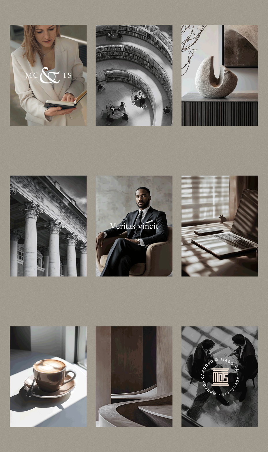
Taking into account that the acronym MCTS was used internally by the team to refer to the office, and that the project's main keywords were "experience, tradition, and trust", the idea arose to unite the initials with the shape of the Greco-roman column, in a monogram format. The vertical lines reinforce stability and structure, generating recognition even in reduced applications. The typographic system combines the main serif font with editorial compositions, and the color system in neutral and earthy tones communicates solidity and sobriety.


Result.
A brand with a timeless, elegant design, easy to recognize and assimilate with its industry. Its application across the most diverse graphic materials (digital and print) demonstrates the good taste expected of a traditional law firm and allows for a more expressive positioning without losing consistency.